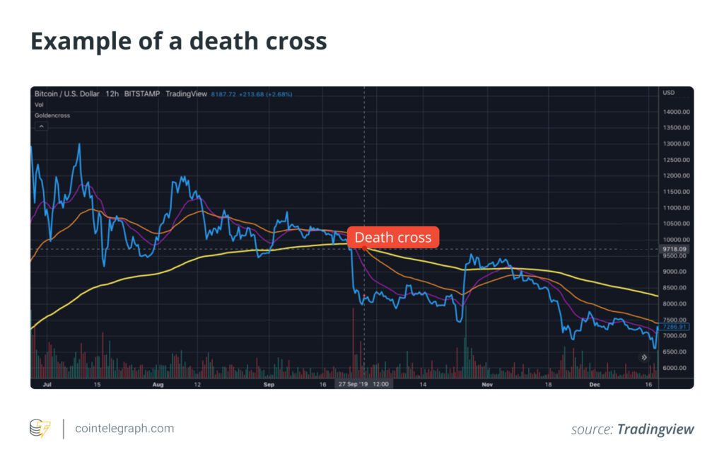
Compared to the golden cross, a death cross involves a downside MA crossover. This marks a definitive market downturn and typically occurs when the short-term MA trends down, crossing the long-term MA.
Simply put, it’s the exact opposite of the golden cross. A death cross is usually read as a bearish signal. The 50-day MA typically crosses below the 200-day MA, signaling a downtrend.
Three phases mark a death cross. The first occurs during an uptrend when the short-term MA is still above the long-term MA. The second phase is characterized by a reversal, during which the short-term MA crosses below the long-term MA. This is followed by the start of a downtrend as the short-term MA continues to move downward, staying below the long-term MA.
Like golden crosses, no two death crosses are alike, but specific indicators signal their occurrence. Here’s a look at each stage of a death cross in detail. The first stage of a death cross is typically marked by an asset being in an uptrend. This is followed by a weakening 50-day MA, the first sign that bearishness may be on the horizon. As prices begin to fall after they peak, the short-term MA diverges from the long-term MA.
The second stage sees the 50-day MA crossing below the 200-day MA. This is a key point, as it signals that the asset may be entering a downtrend. The divergence between the two MAs becomes more pronounced as prices continue to fall. The death cross begins to form much more clearly during this stage.
The final stage is marked by the 50-day MA continuing to trend downward, staying below the 200-day MA. This signals that a downtrend is indeed underway. The death cross typically leads to further selling pressure as traders liquidate their positions in anticipation of further price declines.
If, however, the downtrend is not sustained, it could mean a short-lived momentum and prices rebounding quickly, in which case, the death cross is considered to be a false signal.


